Sydney Opera House: inspired design
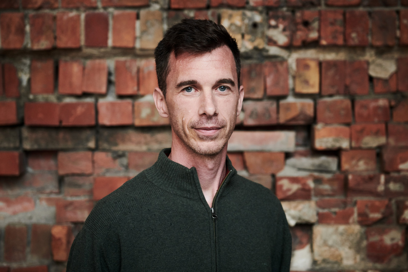
Kieran Larkin, Senior 3D Designer at Museums of History NSW, talked to us about some of the highlights and challenges of designing the landmark exhibition The People’s House: Sydney Opera House at 50, on display at the Museum of Sydney until March 2024.
What were some of the main challenges you faced in designing this exhibition?
This project was unusual, exciting and challenging to design for many reasons. The scope for a single exhibition was larger than any previously held at the Museum of Sydney, covering several spaces across the whole top floor of the museum. The exhibition included multiple digital, immersive, interactive and audio experiences, as well as hundreds of original objects such as programs, posters and costumes from the Sydney Opera House’s collection, the State Archives Collection, and many other lenders and performance companies across Australia.
As well as being large in scale and scope, the project had very tight deadlines. The exhibition research and concept design phase took place simultaneously with the curatorial research over a six-month period, which left just over two months for design development, object layout and production drawings. There were some stressful times, but the content and stories were exactly what MHNSW does so well and these are what give me joy in my work. The core of the People’s House exhibition are the stories of the people who built, maintained, supported, performed in and patronised the Opera House – and continue to do so today.
What were your favourite elements to work on?
Particular highlights included meeting with an external staging company and the Sydney Opera House’s Head of Staging, Warren Sutton, to design and install a 15-metre truss system across the museum’s stairwell. This element echoes the much larger trusses used for concerts held on the forecourt of the Opera House. Staging lights from the Opera House hang from the truss along with large banners representing different performances hosted by the House: rock concerts, First Nations dance, ballet, theatre, opera, family shows and orchestral performances.
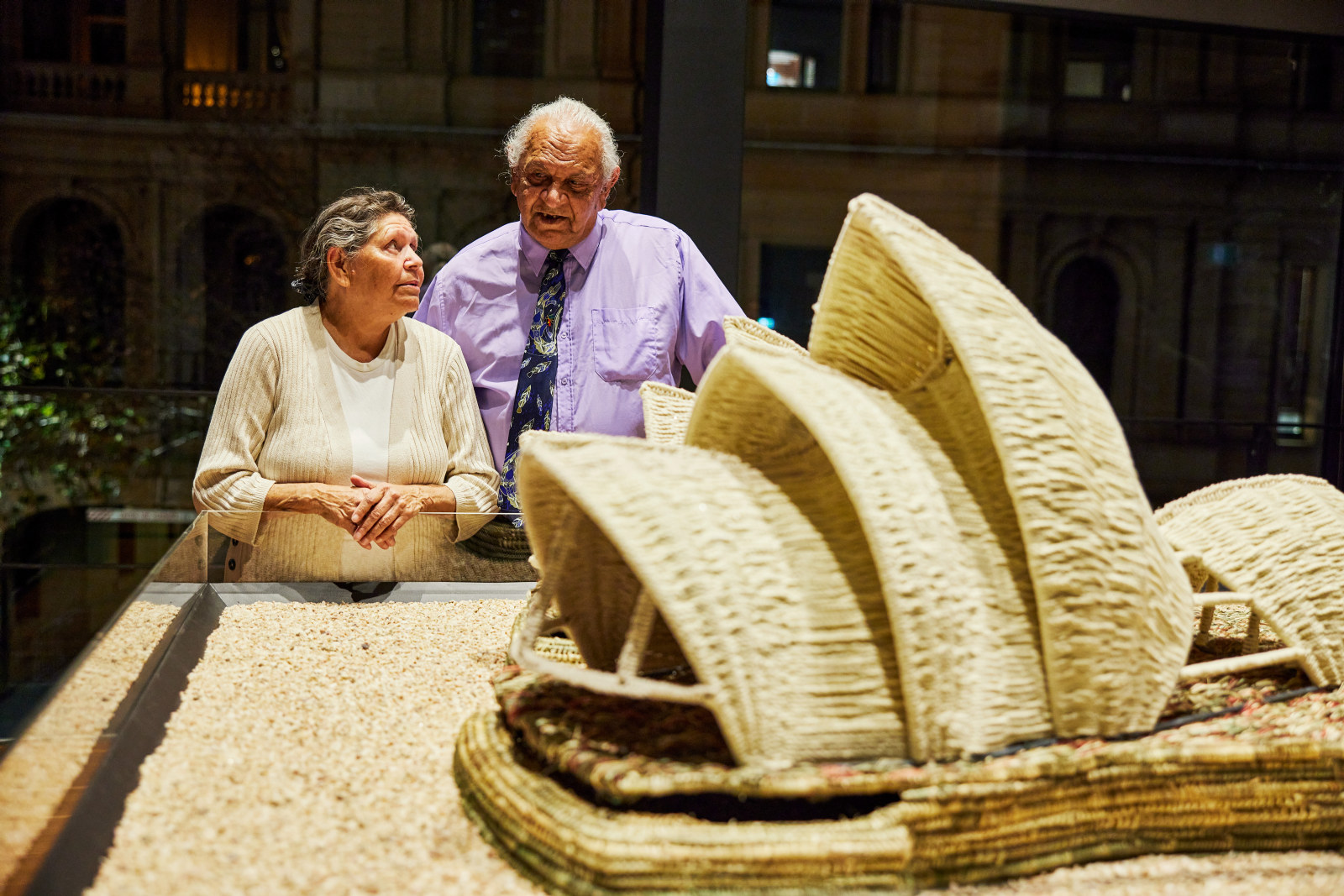
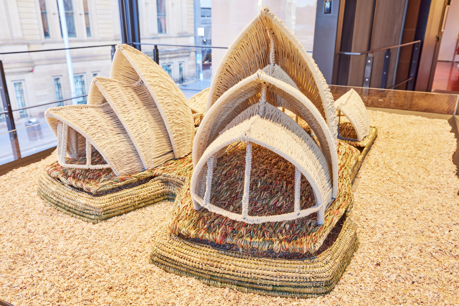
Another great experience was working with MHNSW’s First Nations Curator, Tess Allas, to have a steel form made by a set production company for a woven model of the Sydney Opera House created by First Nations artists Steven Russell and Phyllis Stewart. The final artwork sits on a bed of shell grit and is my favourite work in the exhibition.
Also hugely enjoyable was laying out, with exhibition curator Scott Hill, the 23 programs (all we could fit in the showcase) he chose to represent the first year of performances at the Sydney Opera House, in 1973–74. The programs reflect the amazing breadth and diversity of performances hosted by the House right from its opening day. They range from Romeo and Juliet to the Bee Gees and the drag show Les Girls. The showcase materials and design – limed birch plywood and red-painted interiors – are inspired by the seating and tiers of the Concert Hall. The placement of the programs is designed to draw the exhibition visitor’s eye to the stage beyond.
How did you ensure that visitors could not just appreciate the extraordinary story of the Sydney Opera House but also express their own thoughts and feelings about this beloved building?
A learning I brought to the show was the importance of incorporating an opportunity for visitors to contribute and give feedback by hand. Digital interactives such as the Maestro space, which enables visitors to conduct a digital orchestra, are great for creating immersive environments and allowing visitors to interact with layers of information, but they’re never as accessible and intuitive as a simple piece of paper and a pencil. A short invitation – in this case, ‘Share your favourite memory of the Sydney Opera House’ – is all it takes to encourage visitors of all ages to share, in words or a drawing, their experiences and opinions. Once the exhibition opened, the responses quickly built up to create a rich, often light-hearted and sometimes poignant source of visitor-created content that others could enjoy and reflect on.
The design for this section was based on the chevron pattern of the Sydney Opera House’s sails. Visitors place their completed tile-shaped pieces of paper into the structure as if they are leaving their memories on the shell of the building.
Published on
Related exhibition
Past exhibition
The People’s House: Sydney Opera House at 50
Celebrating five decades of extraordinary performances and unforgettable moments from the Sydney Opera House
Saturday 1 July
Sydney Opera House
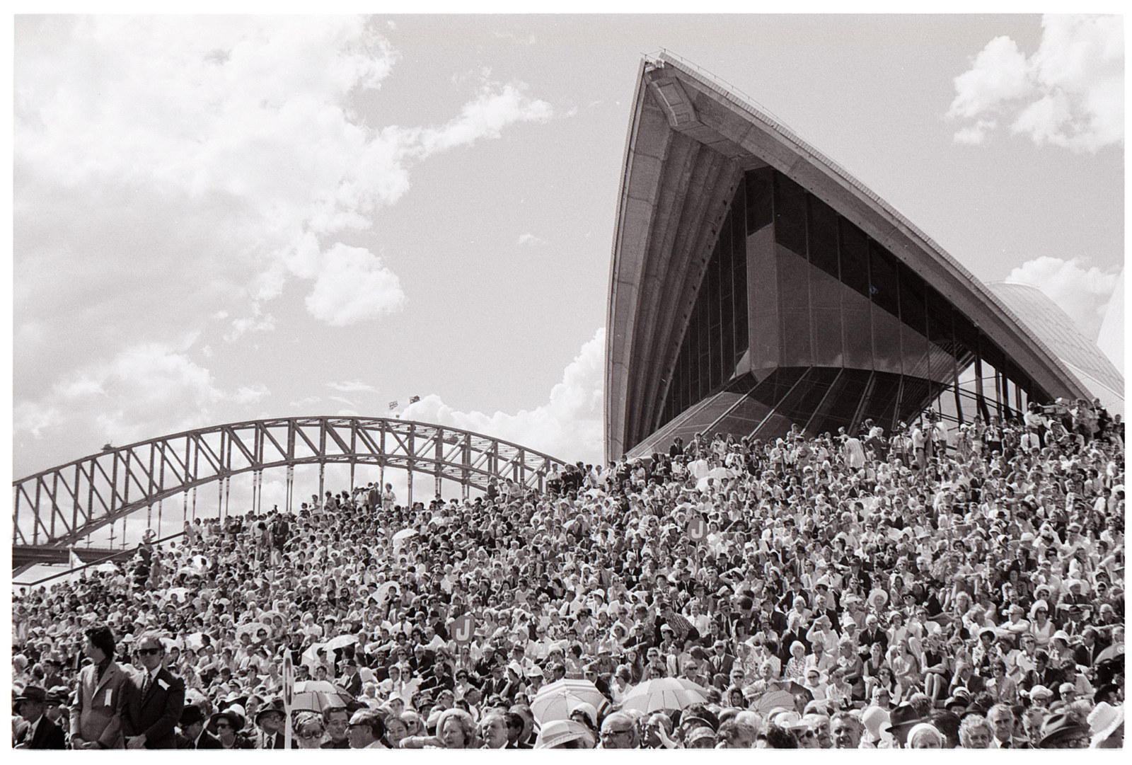
‘The people’s house’: what’s in a name?
The ‘Sydney Opera House’, the ‘Opera House’, or simply ‘the House’ – we know it by many names. But why is this Australian icon also called ‘the people’s house’? Exhibition curator Dr Scott Hill explores the story behind a name
First Nations
How to weave an opera house
Inspired by a stunning shellworked model of the Sydney Opera House by Bidjigal artist Esme Timbery, First Nations curator Tess Allas commissioned a woven model of the iconic building from master weavers Steven Russell and Phyllis Stewart

Dressing Joan Sutherland
One of the most spectacular costumes on display in the exhibition The People’s House: Sydney Opera House at 50 is an extraordinary Renaissance dress designed by Kristian Fredrikson and worn by Dame Joan Sutherland in the part of the notorious Lucrezia Borgia
